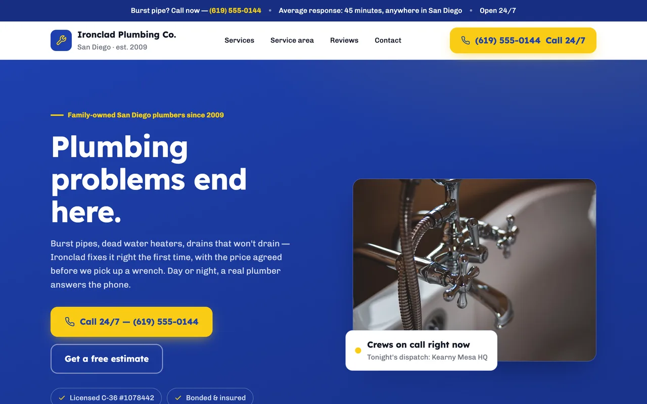
Search for a plumber and you will find two kinds of websites. One kind is a brochure: a stock photo of a kitchen, a paragraph about "quality service", and a phone number somewhere in the footer. The other kind is built for a person standing in an inch of water at nine at night. The second kind gets the call.
This guide is about the second kind. It covers what those sites have in common, walks through one published example section by section, and lays out what each way of getting a site built will cost you in money and in your own time.
What the plumber websites that get calls have in common
Plumbing is bought under pressure. Most visitors arrive on a phone, from a search, with a problem that is getting worse while they read. That changes what a good website is. Design that would be a strength for a restaurant or a design studio is a liability here. The sites that convert share seven habits.
1. The phone number is in the first screen and it dials
Not in the footer. Not in an image. A real tel: link in the header and again in the hero, large enough to tap with a thumb. If a visitor has to scroll or pinch to find your number, some of them will go back to the search results and call the next listing.
2. The service area is written out in words
"Serving the greater metro area" tells a homeowner nothing and tells Google less. Name the cities and neighborhoods you actually drive to. That text is what lets your site appear when someone searches for a plumber in their own town, and it is what reassures a visitor that you will come to them.
3. Services are listed the way customers describe the problem
Customers search for "water heater not working" and "drain clogged", not for "residential hydronic systems". A service section that names emergency and leak repair, water heaters, drains and sewer, repipes, fixtures, and water quality in those words matches the vocabulary of the search and answers the first question a visitor has: do you do the thing I need?
4. Licence and insurance are visible without being asked
Homeowners are letting a stranger into their house to work on the pipes. Your licence number, insurance status, and years in business belong on the page in plain text, near the top. This is the cheapest trust signal you have, and the sites that hide it in an "about" subpage give up that advantage for nothing.
5. The photographs are yours
A photo of your van, your crew, or a job you finished last month beats any stock image. Stock photography signals a template; a real truck with your name on the door signals a company that exists and will show up. If you have no photographs yet, a plain page with none is better than a page full of somebody else's kitchen.
6. Emergency availability is stated, not implied
If you take calls after hours, say so, with the hours. If you do not, say that too. An honest "same-day service, Monday to Saturday" wins more of the right calls than a vague "24/7" that your voicemail contradicts.
7. It loads fast on a phone
Large hero videos, slideshow carousels, and chat widgets that load before the content all cost seconds on a mobile connection. A plumbing site does not need to be impressive. It needs to be readable within a couple of seconds on the phone in a homeowner's hand.
The test is simple. Open your site on a phone, pretend the kitchen is flooding, and time how long it takes to find a number you can tap. If the answer is more than a few seconds, the design is working against you.
One published example, section by section
The Ironclad Plumbing site linked below is a demonstration published on FyneSite. It is not a customer's business, and it is useful here because it shows most of the habits above in a real page rather than a checklist. It also shows what no demonstration can supply: the photographs are stock placeholders, the trust section names a licence class without a licence number, and every promise on it (arrival windows, pricing, guarantees, insurance, crew screening) is placeholder copy. All of that is yours to verify or replace before you publish.
- Hero. One line, "Plumbing done right the first time", with a tap-to-call number beside it. Nothing to scroll past.
- Services. Six sections named the way a customer would search for them: emergency and leak repair, water heaters, drains and sewer, repipes and remodels, water quality, fixtures and maintenance.
- Pricing posture. A section headed "No mystery, no surprises" that explains how quotes work before the customer has to ask.
- Trust. "Built on a handshake, backed in writing", the place for licence, insurance, and guarantee language. The draft says "CA C-36 licensed" and "fully bonded"; a real company adds its licence number here.
- Closing action. "One call, we're on the way", with the number repeated. The page carries seven tap-to-call links in total, so the number is never more than one thumb away.
What the example does not have is also worth noticing: no slideshow, no video background, no popup. That restraint is the design. What it still needs from an owner is everything a demonstration cannot know: your own photographs in place of the placeholders, your licence number where the class is named, and your real hours, arrival windows, pricing, guarantees, and insurance in place of the sample promises. Publish nothing about availability, price, or credentials that is not true of your company.
What a plumber website costs, by the way you get it
There are three common ways to end up with a plumbing website. They differ less in the finished page than in what they ask of you and who owns changes afterwards.
| Path | What you pay for | What it asks of you | Who changes it later |
|---|---|---|---|
| Freelancer or agency | A one-time build, sometimes plus a maintenance retainer | Briefing, feedback rounds, supplying photos and copy, waiting for delivery | Depends on the handover: you, if they leave you an editable site and show you how; otherwise the builder, by request |
| Done-for-you subscription | A monthly fee, often with a setup charge, for a site someone else assembles from your details | A questionnaire and a launch wait | Their support team, by request |
| AI website builder (FyneSite) | A draft generated from your description; free to publish on a FyneSite address, paid for a custom domain and branding removal. Other builders set their own publishing terms, some paid | Describing your services and area, then reviewing the draft | You, in plain English, whenever the hours or services change |
The question to ask of any path is not the headline price but the cost of the next change. Plumbing companies change hours, add a service, hire a second crew, and expand their area. Whatever path you take, make sure you know before you sign who can change the hours on the site, and what that costs.
FyneSite is the third path. You describe your services and the towns you serve, review an editable draft, and publish free on a FyneSite address. A paid plan adds your own domain and removes FyneSite branding; current prices are on the pricing page.
Before you publish: a ten-minute checklist
- Tap the phone number on a phone. It should open the dialler, not a contact page.
- Read the service area aloud. Every town you drive to should be in text on the page.
- Find your licence number. If it takes more than one scroll, move it up.
- Check the hours against your voicemail. The site and the greeting should agree.
- Replace any stock photo you can. A phone photo of your van is enough.
- Match the number to your listings. The phone number on the page should be the same one on your Google Business Profile and directory listings, so a customer who sees both is not confused. (Seeing the site in search results is a check for after publishing; a new page can take days or weeks to appear.)
Everything on this list is a content decision, not a design decision. That is the point: a plumber website earns calls by being specific and fast, and both of those are within reach of any company that can describe its own work.